dentauraM4 Theme

Free Boostrap 4 Theme : just a helper for the mobirise community

dentauraM4 Theme is absolutely free. Those who wish to support us with a developer payment can send us payment using paypal/credit card/debit card using paypal payment gateway.


If the plugin saved you some time or helped you to create something awesome, please consider making use of the payment button above.

Theme can be imported in extensions. For importing a new version, the old version will have to be deleted. Create a new theme using the Dentaura M4 theme and then save the blocks as user blocks to move to other projects. Some of the blocks are suitable for coders/those who know to edit html & css, however non coders also can manage.

Highly customizable options with block controls.
Instructions given in some blocks as a subtitle of block.

1. Dentaura has no intentions to violate any rules and copyrights of Mobirise. Mobirise and the Mobirise Logo are trademarks of Mobirise.com and are acknowledged as such.
2. This theme is just a helper for the mobirise community.
3. Trying to provide what mobirise doesn't offer now or with better options. Dentaura recommends usage of the Mobirise code editor as a must for editing the html and css.
4. Always as a third party extension, the usage of Dentaura M4 theme will be at your own risk. Dentaura.com holds no responsibility on any loss incurring on using this theme.
5. Kindly take proper backups before using any 3rd party extensions.
6. Time to time release of mobirise updates can affect the function of 3rd party extensions mostly due to js clashes. Disabling the 3rd party extensions till fixes are provided will be ideal. Always when issues are noted, kindly disable and test.

1. Just before publishing, we can drag and drop the preloader, customize and then publish. While designing if u leave such a large block in between, it will be a nuisance. So adding before just publishing is fine.
2. Pls do a test, publish and see the site is working fine, then add a preloader and publish for final. If the site has components which take time to load, till that time preloader will be working.
3. Anytime it can be added or deleted. If someone wants it in all pages, add global to the section tag in html.
4. Pls follow logo size as per mentioned in the blocks.

1. When using wave dividers (with too much height) which overlap upper or lower blocks, height of the overlapped block has to be adjusted with breakpoints for mobile, tab and Desktop.
2. When using wave dividers (with too much height) test in different screen size to know wave is getting cut off and adjust the wave cover accordingly..
3. When using dividers vertically flipped down and more than one dividers used together flipped down, block order has to be set to avoid improper overlapping issues.
4. Animated wave dividers may not work in all browsers. However, it has been checked and verified as working in all major recent browsers.

WARNING: Overlapping blocks may not be suitable in all situations. Kindly use only in suitable situations and try to customize the overlapped block heights also accordingly (might be suitable for coders in some situations).

Dentaura M4 v.2.5.1
Temporary fix for Pre-loader to work in recent versions. Install Dentaura M4 v.2.5.1 and then add following code in Global HTML Insert > Before </head> code
<style>/* dentaura preloader start */ #loading-preloader{height:100%;width:100%;position:fixed;margin-top:0;top:0;left:0;z-index:9999} /* dentaura preloader end */</style>

Dentaura M4 v.2.5.0
Minor updates

Dentaura M4 v.2.4.10

New Blocks: 3 Back to top buttons

Dentaura M4 v.2.4.9

Added headers in control panel for spacer block

Dentaura M4 v.2.4.8

New Blocks: 8 Preloaders (5 with logo)

Dentaura M4 v.2.4.7

New Blocks: 3 Preloaders

Dentaura M4 v.2.4.6

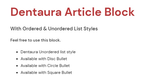
New Block: 1 Article block with ordered and unordered list styles

Dentaura M4 v.2.4.5

New Blocks: 1 Preloader, 12 dividers, 2 animated dividers, 1 Cards block with reverse order, 1 Photo gallery with reverse order.
In old blocks:
1) Photo Gallery - Sortable: Download button added.
2) Updated instructions for lightbox group id in sortable photo gallery.
3) Skew Dividers: Now it is possible to give skew effect to left side also.

Dentaura M4 v.2.4.4
All previous blocks have been re-done with better block controls, html & css.
New Blocks: 1 Preloader, 2 Cards, 1 spacer to put beneath menu, 6 dividers
Fixes: Gallery: the lens icon position has been centered, so removed positioning controls.

Dentaura M4 v.2.4.3
3 customizable preloaders - Preloaders are what you see on the screen while the rest of the page's content is still loading. It keeps visitors entertained while page components finish loading.
1 sortable photo gallery with small thumbnail and card text, large image & lightbox with caption/title. Sorting facility can be disabled if not required.
Capacity: 100.
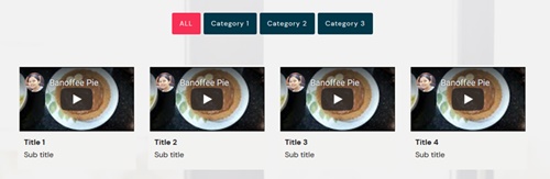
1 sortable video gallery for youtube and vimeo. Capacity: 30 videos, however can increase upto 100 at your own risk. Sorting facility can be disabled if not required
1 masonry gallery with vertical image order with small thumbnail and card text, large image & lightbox with caption/title. Capacity: 100.

Theme Blocks

Preloader

Preloader 1

Preloader with 3-4 dots. Color of dots and background can be changed.

Preloader

Preloader 2

Preloader with 4 biased squares. Color of squares and background can be changed.

Preloader

Preloader 3

Preloader with strips. Color of strips and background can be changed.

Cards

Masonry Cards - Vertical Order

Capacity of upto 100 cards with masonry style in vertical order. Images, subtitle, title, text, button can be added.

Cards

Cards - Sortable

Capacity of upto 100 cards with sortable tabs. Images, subtitle, title, text, button can be added. Sorting facility can be disabled.

Gallery

Masonry Photo gallery with lightbox - Vertical Order

Capacity of upto 100 images having masonry style in vertical order with lightbox. Separate thumbnails linked to the respective original image in lightbox with caption. Card title and text can be added.

Gallery

Photo gallery with lightbox - Sortable

Capacity of upto 100 images with sortable tabs.  Separate thumbnails linked to the respective original image in lightbox with caption. Card title and text can be added. Download button can be enabled. Sorting facility can be disabled.

Gallery

Video gallery - Sortable

Video gallery with sortable tabs can embed youtube and vimeo videos. Only 30 videos are currently enabled in this block to avoid browser crashing. However upto 100 videos can be enabled in via code editor in html block at your own risk. Sorting facility can be disabled.

Preloader

Preloader 4

Preloader with spinner. Color of spinner and background can be changed. Option for Single or dual spinner.

Spacer

Spacer 1

To put beneath menu to avoid menu overlapping and covering header block content. Card height and color can be adjusted. You can also use this block in combination with divider blocks.

Divider

Skew Divider - with shadow

Divider with shadow facility. Skew angle, height of block, shadow properties etc can be edited.

Divider

Line Dividers  - 5 types

5 types of line dividers - dashed, dotted, solid, double and split ends. Divider type, width, thickness, color etc of divider can be edited.

Divider

Symbol Dividers - 3 types

3 types of symbols in divider - section mark, scissors and heart. Divider type, width, thickness, color etc of can be edited.

Divider

Text Divider - 3 line types

Text can be added in center of divider with 3 line types - dashed, dotted, solid.

Divider

Arrow Divider -with skew

Arrow divider with skew and shadow facility. Skew angle, height of block, shadow properties etc can be edited. Height of arrow can be adjusted by altering height of upper part.

Divider

Diamond Divider

Diamond Divider with text above and below.

Preloader

Preloader 5

Preloader with triple spinner. Color of spinner and background can be changed. Option for changing color of components together or individually.

Gallery

Photo gallery with lightbox - Sortable -Reverse Order

Capacity of upto 100 images with sortable tabs in reverse or descending order. Separate thumbnails linked to the respective original image in lightbox with caption. Card title and text can be added. Download button can be enabled. Sorting facility can be disabled.

Cards

Cards - Sortable -Reverse Order

Capacity of upto 100 cards with sortable tabs in reverse or descending order. Images, subtitle, title, text, button can be added. Sorting facility can be disabled.

Divider

Skew Divider - Overlapping upper & lower blocks

Divider overlaps both upper and lower blocks. In case skew feature in one side need to be avoided, 'spacer 1' block can be used in that side. Can be used with combination of spacer block if required to avoid skew in one side.

Divider

Arrow divider - overlap lower block

Arrow divider overlapping lower block. Size of arrow can be adjusted.

Divider

Curve divider - overlap upper or lower block by flipping

This curve divider can be used to overlap upper or lower block. 1 or 2 such blocks can be used together with different colors or with other dividers too. The divider can be flipped horizontally and vertically.

Divider

Curve divider 2 - overlap upper or lower block by flipping

This curve divider can be used to overlap upper or lower block. 1 or 2 such blocks can be used together with different colors or with other dividers too. The divider can be flipped horizontally and vertically.

Divider

Wave divider - overlap upper or lower block by flipping

This wave divider can be used to overlap upper or lower block. 1 or 2 such blocks can be used together with different colors or with other dividers too. The divider can be flipped horizontally and vertically.

Divider

Wave divider 2 - overlap upper or lower block by flipping

This wave divider can be used to overlap upper or lower block. 1 or 2 such blocks can be used together with different colors or with other dividers too. The divider can be flipped horizontally and vertically.

Divider

Wave divider 3 - overlap upper or lower block by flipping

This wave divider can be used to overlap upper or lower block. 1 or 2 such blocks can be used together with different colors or with other dividers too. The divider can be flipped horizontally and vertically.

Divider

Wave divider 4 - overlap upper or lower block by flipping

This wave divider can be used to overlap upper or lower block. 1 or 2 such blocks can be used together with different colors or with other dividers too. The divider can be flipped horizontally and vertically.

Divider

Wave divider 5 - overlap upper or lower block by flipping

This wave divider can be used to overlap upper or lower block. 1 or 2 such blocks can be used together with different colors or with other dividers too. The divider can be flipped horizontally and vertically.

Divider

Wave divider 6 - overlap upper or lower block by flipping

This wave divider can be used to overlap upper or lower block. 1 or 2 such blocks can be used together with different colors or with other dividers too. The divider can be flipped horizontally and vertically.

Divider

Wave divider 7 - overlap upper or lower block by flipping

This wave divider can be used to overlap upper or lower block. 1 or 2 such blocks can be used together with different colors or with other dividers too. The divider can be flipped horizontally and vertically.

Divider

Wave divider 8 - overlap upper or lower block by flipping

This wave divider can be used to overlap upper or lower block. 1 or 2 such blocks can be used together with different colors or with other dividers too. The divider can be flipped horizontally and vertically.

Divider

Animated wave divider - overlap upper or lower block by flipping

This animated wave divider can be used to overlap upper or lower block. 1 or 2 such blocks can be used together with1111 different colors or with other dividers too. The divider can be flipped horizontally and vertically.

Divider

Animated wave divider 2 - overlap upper or lower block by flipping

This animated wave divider can be used to overlap upper or lower block. 1 or 2 such blocks can be used together with different colors or with other dividers too. The divider can be flipped horizontally and vertically.

Article block

Article block with ordered and unordered list styles

Ordered list available with 5 styles & Unordered list available with 3 styles

Preloader

Preloader 6

Preloader with pulse. Color of pulse and background can be changed.

Preloader

Preloader 7

Preloader with ping pong. Color of ping pong and background can be changed.

Preloader

Preloader 8

Preloader with audio effect. Color of the effect and background can be changed.

Preloader

Preloader 9

Preloader with square. Color of the square and background can be changed.

Preloader

Preloader 10

Preloader with spinning dots. Color of the dots and background can be changed.

Preloader

Preloader 11

Preloader with spinning dots. Color of the dots and background can be changed.

Preloader

Preloader 12

Preloader with logo. Logo can be animated in 4 different styles. Background can be changed. Logo border can be rounded.

Preloader

Preloader 13

Preloader with logo and 3-4 dots. Color of dots and background can be changed. Logo border can be rounded.

Preloader

Preloader 14

Preloader with logo and triple spinner. Color of spinner and background can be changed. Option for changing color of components together or individually. Logo border can be rounded.

Preloader

Preloader 15

Preloader with logo and square outline. Color of square and background can be changed. Color of logo background can be changed or made transparent. Logo border and square outline can be rounded.

Preloader

Preloader 16

Preloader with logo and square outline. Color of square and background can be changed. Color of logo background can be changed or made transparent. Logo border and square outline can be rounded.

Back to top button

Back to top button with Color changeable arrow

Back to top button with ability to change the color of button and arrow. Border & shadow options are available. Square to round shape is possible. Ability to set position in Desktop/Tab/Mobile.

Back to top button

Back to top button with Black & White Arrows : 5 Types

Back to top button with ability to change the color of button. 5 types of arrow designs are available in both black and white colors. Border & shadow options are available. Square to round shape is possible. Ability to set position in Desktop/Tab/Mobile.

Back to top button

Back to top button with Your own image

Back to top button with ability to upload your own image is possible. Border & shadow options are available. Square to round shape is possible. Ability to set position in Desktop/Tab/Mobile.


* Mobirise and the Mobirise Logo are trademarks of Mobirise.com and are acknowledged as such.

dentauraM4 Theme